FlowingData
flowingdata.com · EN
- 10posts a week
- 9 Novlast post
- #5in Data Science
Strength in Numbers
Subscribe
Latest posts
A brain from simple circuits
Aatish Bhatia and Arkarup Banerjee use a visual explainer for how a few… Tags: Aatish Bhatia , Arkarup Banerjee , brain , Myriad , neurons
Swings in Texas over the years
The New York Times produced a series of charts for the shift in… Tags: elections , New York Times , partisanship , Texas
Hairy election margins map
You’ve seen maps of the results and maps of the shifts. For the… Tags: elections , midterm , Wall Street Journal
Data exploration, manually and intentionally
Randy Au on the manual process of exploratory data analysis that is still… Tags: automation , Large Language Model , Randy Au
✚ Shifting chart options
In this week's The Process , we look at the ones that highlight the big shifts and see how changing focus can change the story. Tags: options , switch
Mountain peaks to show the shifts
Bloomberg used mountain peaks to show the shifts towards Democrats and Republicans. Taller… Tags: Bloomberg , elections , midterm
Shift in margins for Midterms 2026, by county
The New York Times brings back the angled arrows to map the shift… Tags: elections , midterm , New York Times
Benchmark chair
James Birdle described his experiment using AI to assist in chair design: What… Tags: chair , creativity , Emergence Magazine , James Birdle , process
Percentage of votes counted so far
For the Washington Post, Dylan Moriarty has a live tracker for the percentage… Tags: turnout , voting , Washington Post
Needle of uncertainty is live for Midterms 2026
If feeling uncertain is your thing, the Needle from the New York Times… Tags: election , midterm , needle , New York Times , uncertainty
Election night mirages
As midterm election results come in tonight, percentages can flip in favor of… Tags: election , forecast , New York Times , uncertainty
Google cherrypicks small data for Gemini ad
During the World Series, Google ran an ad for Gemini that noted several… Tags: baseball , cherrypicking , Google , Marcos Huerta , moon
Early voting jumps
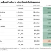
Evan Reynolds and Christine Zhang, for the New York Times, have quick tabulations… Tags: election , midterm , New York Times , turnout
Where the Musk money flows
Elon Musk has donated $446 million for the midterm elections, because sure why… Tags: election , Elon Musk , Guardian , midterm , spending
Increasing Trump comments on body appearance
For the Washington Sun, Andrew Van Dam and Manuela Silva note the uptick… Tags: body , Washington Sun , words
Worst Halloween candies, according to the data
What candies usually land in the throwaway pile? Tags: candy , Halloween
Policing protests in India
With more demonstrations and protests in India, Reuters charts and illustrates current tactics… Tags: India , police , protest
Cost of greed, as unbearably tall chart
Last month, the Wealth Inequality in America video by Politizane got an update… Tags: billionaires , scale , scroll , wealth
✚ Visualization tools and learning resources, October 2026 roundup
Every month, I gather tools and resources to make better charts that communicate and reveal. Here is what happened in October. Tags: roundup
Cost of college versus the return on investement
For the New York Times, Arfa Momin and Ron Lieber charted median income… Tags: college , education , income , New York Times
In the directory since 25 Sept 2026 · last checked 9 Nov 2026 · RSS